Skip links

How To Choose The Right Colors for Your Cafe or Restaurant Interior

Introduction:

Color evokes emotion and has the power to encourage or discourage certain actions and behaviors, making it a powerful tool for interior design. Picking the right colors for restaurant or cafe interiors can mean the difference between an average design and an excellent one — one that is effective in achieving the purpose of the space. decoration
Our brain translates each color and responds accordingly by sending signals to different parts of our body. Not only can colors evoke emotion, but they also have the power to affect feelings of thirst and hunger. Studies have shown that colors can also subconsciously influence customers’ food choices and the amount of money they spend. Ultimately, this means that a restaurant or cafe’s color palette is the first point of contact with target customers. This makes it all the more important to be strategic in your choice of colors in your cafe or restaurant interior design.
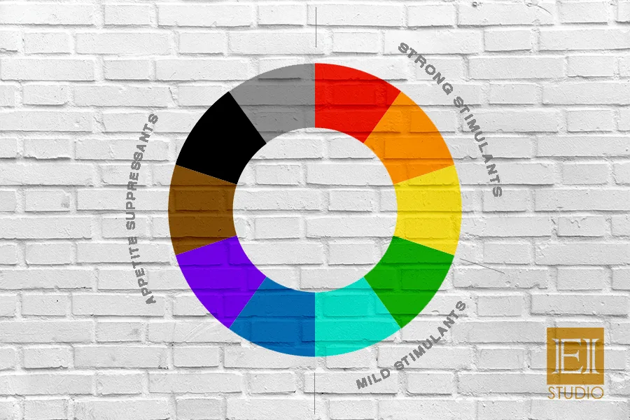
 
 
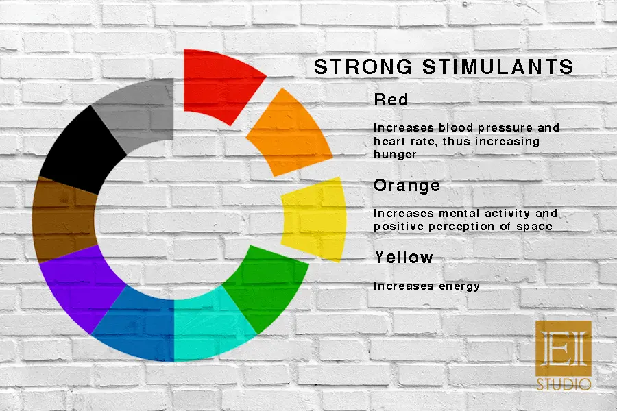
Colors, in the context of food & beverage interior design, can be grouped into 3 categories: strong appetite stimulants, mild appetite stimulants, and appetite suppressants. We will discuss each in detail for you to answer three questions that will help you come up with an effective interior color scheme: What message do I want to convey; What kind of customers do I want to attract; How do I want my customers to interact with my space?
 

1. STRONG APPETITE STIMULANTS


When you think of all your favorite fast food restaurants, I’m willing to bet they use red, orange, or yellow in abundance. This is because these colors are known to increase the heart rate and blood pressure, which creates a feeling of excitement. Red encourages impulsive buying and eating more. Orange evokes a cheerful response to the space, and yellow is associated with citrusy, refreshing flavors. Together, these colors makes customers feel eager, eat fast, and leave.
 

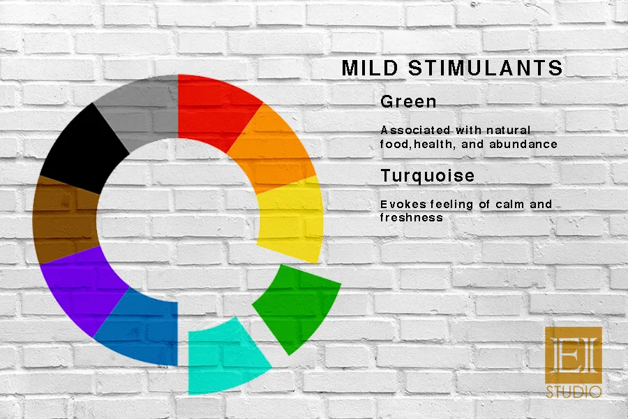
2. MILD APPETITE STIMULANTS


Many people assume green is a strong appetite stimulant because it’s the color closest to nature. However, natural green vegetables and fruits are more fibrous and have less natural sugars compared to their more brightly colored counterparts. Green signals health and turquoise is associated with being fresh. Together, these two colors are perfect for health and fitness-themed restaurants and cafes as customers will be more inclined to eat well-balanced food.
 

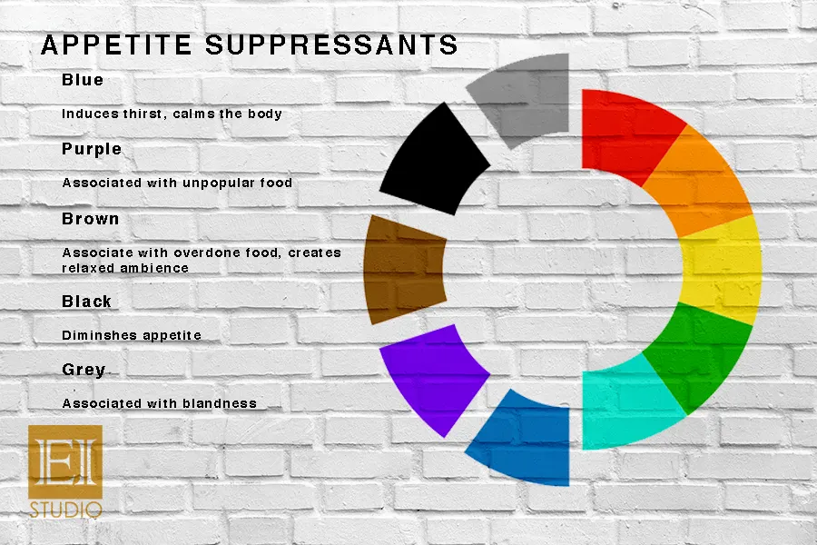
3. APPETITE SUPPRESSANTS


Blue and purple curb appetite for many reasons. For one, both colors very rarely exist naturally in nature in the form of food. Blue, however, provokes the kidneys and can influence thirst, making it a perfect primary color for beverage shops. Black is associated with poison, whilst grey hints at blandness — both not good for when you want customers to be excited to eat. Brown, even though grouped with appetite suppressants, occurs so widely in nature that it is not solely associated with food. It creates a relaxed ambience and encourages customers to stay more, while also associated in our minds to coffee and chocolates — both crowd favorites. This tends to be an effective color scheme for cafe interiors

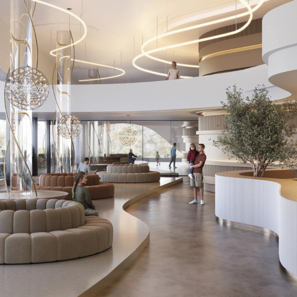
Other factors such as hue and tone also need to be considered when getting your restaurant or cafe interiors color scheme just right. Warm tones trick the mind into thinking that the temperature is warmer, while cool tones send a psychological message that the temperature is cool and relaxed. Light colors make small spaces look large, making it ideal for smaller shops. Dark, earthy colors like maroon encourages relaxation — perfect for lounges.

COLOR COMBINATIONS SHOULD GENERATE A RANGE OF EMOTIONS AND BEHAVIOR IN CUSTOMERS AND NOT AIM AT A SPECIFIC ONE. PICK COLORS BASED ON THE EXPERIENCE YOU WANT YOUR CUSTOMERS TO HAVE AS SOON AS THEY COME ACROSS YOUR RESTAURANT OR CAFE INTERIORS, AND YOU’LL BE GOOD TO GO!

Have a project in mind? Send a message.

Get the book for free
Leave a comment

× WhatsApp