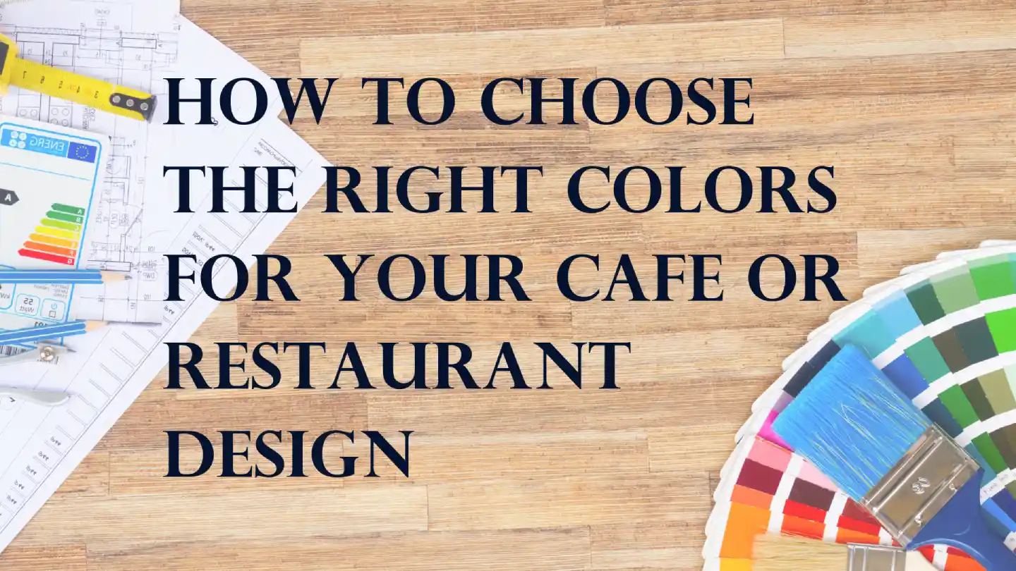
Our brain translates each color and responds accordingly by sending signals to different parts of our body. Not only can colors evoke emotion, but they also have the power to affect feelings of thirst and hunger. Studies have shown that colors can also subconsciously influence customers’ food choices and the amount of money they spend. Ultimately, this means that a restaurant or cafe’s color palette is the first point of contact with target customers. This makes it all the more important to be strategic in your choice of colors in your cafe or restaurant interior design.
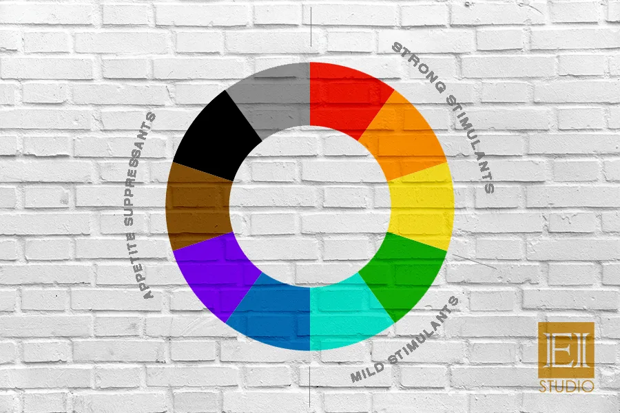
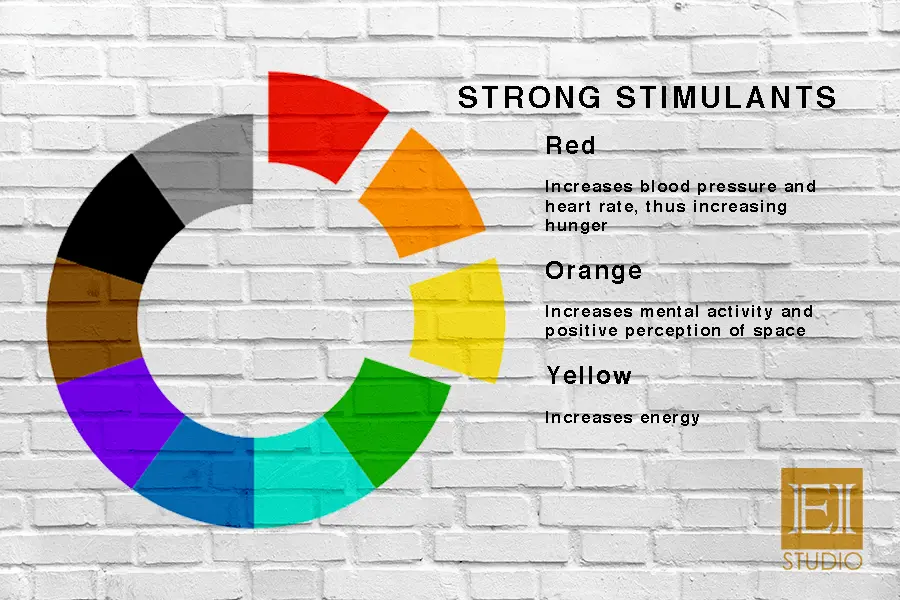
1. STRONG APPETITE STIMULANTS
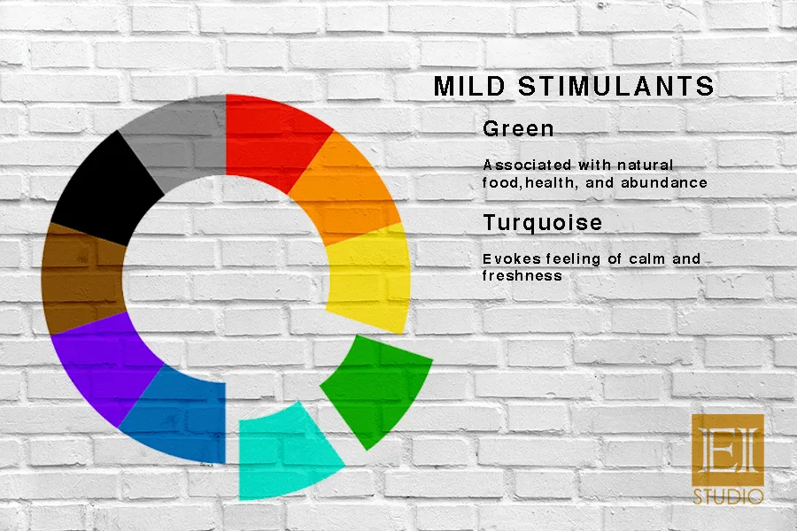
2. MILD APPETITE STIMULANTS
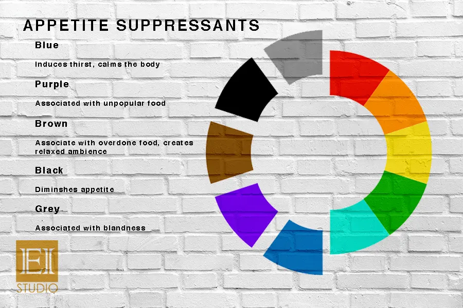
3. APPETITE SUPPRESSANTS
Other factors such as hue and tone also need to be considered when getting your restaurant or cafe interiors color scheme just right. Warm tones trick the mind into thinking that the temperature is warmer, while cool tones send a psychological message that the temperature is cool and relaxed. Light colors make small spaces look large, making it ideal for smaller shops. Dark, earthy colors like maroon encourages relaxation — perfect for lounges.
COLOR COMBINATIONS SHOULD GENERATE A RANGE OF EMOTIONS AND BEHAVIOR IN CUSTOMERS AND NOT AIM AT A SPECIFIC ONE. PICK COLORS BASED ON THE EXPERIENCE YOU WANT YOUR CUSTOMERS TO HAVE AS SOON AS THEY COME ACROSS YOUR RESTAURANT OR CAFE INTERIORS, AND YOU’LL BE GOOD TO GO!
Have a project in mind? Send a message.
Get the book for free